Nghe An Tourism Industry has a new logo
After a period of launching, the Organizing Committee of the Nghe An tourism logo design contest received 131 entries from authors inside and outside the province. Through the preliminary and final rounds of review, selection, and grading, the Jury selected the 4 entries with the highest scores.
(Baonghean.vn) -After a period of launching, the Organizing Committee of the Nghe An tourism logo design contest received 131 entries from authors inside and outside the province. Through the preliminary and final rounds of review, selection, and grading, the Jury selected the 4 entries with the highest scores.
Of the 4 finalists, the design by Nguyen Phuoc Duc (No. 390/1 Nguyen Kiem Street - Ward 3, Phu Nhuan District, Ho Chi Minh City) was recognized by the People's Committee of Nghe An province as the symbol of Nghe An tourism (according to Decision No. 3023 dated July 16, 2013).
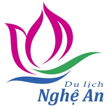
New logo of Nghe An Tourism
Nghe An Tourism Symbol has the following form and meaning:
- The overall symbol represents the elements: lotus petals like friendly, welcoming, open hands; like a ship reaching out to cross the ocean with all the faith in the development of the available potential of Nghe An Tourism in the current integration trend. The gentle and elegant words Nghe An Tourism combined below the logo create an impressive vision.
- Nghe An Tourism Symbol has 3 main colors: Magenta Red: Bright, dynamic, impressive color of Lotus; Green: Youthful, developing, symbolizing ecosystem; Blue: Confident, sustainable, potential for sea tourism.
Thus, from now on Nghe An has a new Tourism symbol and it is widely used on documents, tourism promotion publications, and tourism activities of Nghe An province.
Vuong Bang (NA Tourism Promotion Information Center)