20 clubs with the most beautiful logos in the world.
Each team's logo not only represents its name and tradition, but also embodies profound meanings and beautiful imagery.
 |
Recently, Sports Mail published a list of the 20 football clubs with the most beautiful logos, based on criteria such as style, history, and profound meanings.
Interestingly, this list shows that the giants of world football seem to be completely overshadowed by smaller clubs. Let's take a look at the outstanding names that have caught the eye of Sports Mail.
20. AS Roma, Italy
Ranked 20th is AS Roma of Italy – a club whose logo features a mother wolf nursing two young boys. This image seems to illustrate a legend from Rome.
It's the story of two brothers, Romulus and Remus, who were abandoned but rescued and cared for by a female wolf. However, when they grew up, Romulus, consumed by anger over Remus's mistake, killed his brother and subsequently became the sole king of Rome.
 |
| The legend of Rome is prominently featured in the AS Roma logo. |
19. Aberdeen, Scotland
With the image of a football nestled within a net designed like the letter "A" in the word "AFC," this image is positioned right in the center of a circle, representing simplicity, style, uniqueness, and exactly what people see in the club's logo.
The two stars located at the top (on the player's chest) symbolize the two European Championship titles that this team won in 1983.
 |
| A truly unique and meaningful design by Aberdeen. |
18. Club Brugge, Belgium
Simple and straightforward, with understated colors and a crown at the top, Club Brugge easily made it into the top 18 of this ranking. The traditional black and blue colors, along with the club's name at the bottom, are more than enough.
 |
| Brugger's identity is fully expressed through its understated logo. |
17. Burton Albion, England
The club's logo is inspired by the "Skegness Is So Bracing" poster from the 1930s, featuring a portly man chasing a ball.
 |
| The rather playful logo was inspired by a famous poster. |
16. Liverpool, England
The Kop's logo, in addition to its eye-catching appearance and style, also incorporates a very humane message. The two flames on either side were added in 1993 to pay tribute to the victims of the Hillsborough disaster. The image of the Shankly Gates, placed at the top in 1992 along with the words "You'll Never Walk Alone," truly reflects the tradition of the Merseyside club.
 |
| Liverpool pays tribute to the victims of the Hillsborough disaster through its logo. |
15. FC Koln, Germany
This team is also known as "Die Geißböcke" (roughly translated: "The Goats"), so it's not surprising that their logo features an image of a goat.
Founded in 1950, the club added a running goat to its logo two years later. That goat, named Hennes, later became the team's mascot. Interestingly, the club's current goat, Hennes VIII, also has its own Facebook page.
 |
| FC Koln's lucky mascot. |
14. Club Tijuana, Mexico
Many people may not like this image, but conversely, many others will find it quite interesting. The full name of the club is Club Tijuana Xoloitzcuintles de Caliente, where "Xoloitzcuintli" is a breed of hairless dog.
 |
| Club Tijuana of Mexico incorporated an image of a hairless dog into its logo. |
13. PSG, France
Simple yet incredibly stylish, PSG's main shareholders, Qatari investors, wanted to add a globalized image to the club's logo. Therefore, the word "Paris" was placed at the top, while the iconic French symbol – the Eiffel Tower – is positioned in the center. Very classy!
 |
| PSG's logo features a modern design with a distinctly French feel. |
12. Valencia, Spain
Ranked 12th is Valencia, the city second only to Barcelona in the number of Catalan speakers, and naturally, the colors symbolic of this region are present in the club's logo.
The image of the bat that appeared on the coat of arms of this Spanish city continues to be used by Valencia. Moreover, Valencia cleverly had the bat embrace everything.
 |
| Valencia has created a strikingly stylized image of a bat. |
11. Coventry City, England
Take a closer look at the elephant in the center of this logo. Conventry chose the elephant as their emblem because they believed this animal symbolized strength; therefore, the elephant is depicted carrying Conventry Castle on its back, representing their unwavering faith and strong will.
 |
| The elephant is a symbol of Coventry's strength. |
10. Malaga, Spain
Extremely minimalist. An image of Gibraltar Castle in the left corner, interwoven blue and white stripes in the right corner, surrounded by gold borders. All of this is cleverly connected by a dividing line inscribed with the words "MALAGA CF".
 |
| Malaga's design is simple yet very sophisticated. |
9. Orlando Pirates, South Africa
In the 1950s, the Orlando Pirates club in Johannesburg created its own logo by adding a skull and the club's name above and below it.
In 1996, one year after winning the biggest title in African competition, the African Champions League, the star was placed at the top of the logo.
 |
| The Orlando Pirates' rather "dangerous" symbol. |
8. Newcastle, England
Newcastle United's logo is inspired by the city's coat of arms, featuring two seahorses representing the Tyneside region. Furthermore, the North East England club has added a striking image of Castle Keep.
 |
| The logo bears the distinctive mark of the city of Newcastle. |
7. Palermo, Italy
The dominant colors in the team's emblem are pink and black, matching the colors of their traditional kit. The center of the logo features a soaring eagle, the mascot of the city of Palermo, which is also featured in the city's coat of arms.
 |
| Palermo's colors are very eye-catching. |
6. Kaizer Chiefs, South Africa
Here's another very simple design. The logo of this South African club uses yellow and black as its overarching theme, which are also the colors of their kit. The logo only features the club's name, the silhouette of a native South African with two footballs on either side, but that's enough to make an impression.
 |
| The design is understated yet sophisticated enough to earn the Kaizer Chiefs Club the 6th spot. |
5. Colo-Colo, Chile
Here's another image of the iconic people of an entire region. Colo-Colo has cleverly designed the image of the Mapuche people in a cartoon style to highlight its logo, considered one of the most modern designs in the world of football today.
 |
| The logo features a cartoon style and belongs to a club from Chile. |
4. Juventus, Italy
Tradition and symbolism are what the Italian football giant has incorporated into its logo. With alternating black and white stripes within an oval, and the symbol of Turin in the center, Juventus easily ranks 4th on this list.
 |
| The image of the mighty bull in Juve's logo. |
3. Ajax Amsterdam, Netherlands
In 1900, Ajax's logo was just a cartoon image of a player. In 1928, they replaced it with the image of their hero, and the club still uses this logo today. A particularly striking detail in this hero's image is the use of broken lines; if you count carefully, you'll find there are 11 lines in total, each representing a player on the field. Truly ingenious.
 |
| 11 unique design elements and meanings of Ajax. |
2. KAA Gent, Belgium
A team from Belgium – KAA Gent, also known as "The Buffaloes." This nickname originated when Buffalo Bill and his circus came to perform in Gent. The American man became a symbol of the Gent people's struggle, helping them overcome their most difficult times. The locals believe this represents friendship and mutual respect.
 |
| The special meanings behind Gent's logo. |
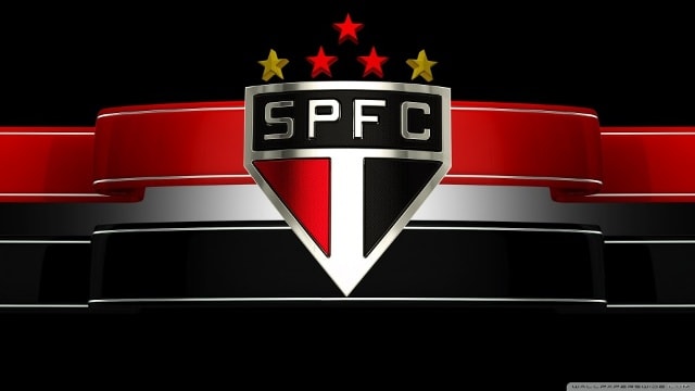
1. Sao Paulo, Brazil
Taking the top spot is the image of a sturdy shield representing the Sao Paulo FC of Brazil. According to the Daily Mail, only the devil would think this image is unattractive or outdated. The blend of red, black, and white combined with the simple "SPFC" lettering above is not only eye-catching and modern but also adds a touch of mystery.
According to Lao Dong newspaper
 |
| The design of Sao Paulo is memorable, easy to understand, and has a touch of mystery. Photo: Getty. |
On the jersey, we can see five stars, two gold and three red. The gold represents world and Olympic record holder Adhemar Ferreira da Silva. The red represents the world championships that Sao Paulo has won.