The unexpected origins of world-famous logos.
McDonald's kept the two golden arches because when flipped upside down they resemble breasts, while Nike's logo was drawn by a student for $35.
McDonald's
|
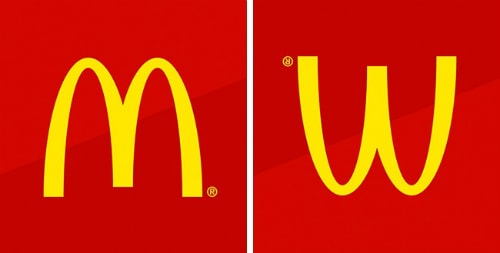
The architect who designed McDonald's first restaurant came up with the idea of two large yellow archways for the building. This architectural feature later became a hallmark of the fast-food industry.
Initially, the company didn't want to choose it as their logo. However, psychologist Louis Cheskin persuaded McDonald's to keep it. He argued that the image, when flipped upside down, resembled a woman's breasts, evoking innocent childhood memories.
channel
|
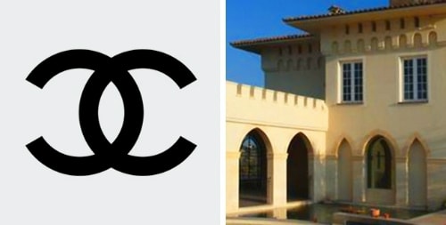
The story behind the creation of this logo is quite special and romantic. Coco Chanel herself designed it during her stay at Château Crémat in Nice, Italy. According to this fashion legend, the brand's symbol was inspired by the castle's dome. Furthermore, the two letters CC are the first two letters of the castle's name. They also represent the creator's name: Coco.
|
The team that created the Google logo used three primary colors: red, yellow, and blue. You can see that the order of the colors in the logo follows a pattern. However, there's an "L" in between, colored green. This implies that Google likes to break the mold and doesn't follow conventional rules.
Gillette
|
At first glance, this logo is nothing more than the brand name. However, the designer inserted a red razor blade between the letters G and I to emphasize the company's razor product.
Mitsubishi
|
Essentially, this logo is the family crest of the Iwasaki clan, the family that founded Mitsubishi. The crest consists of three diamonds, representing reliability, integrity, and success. The logo is red because it signifies confidence. Additionally, the Japanese believe this color is very attractive to customers.
Nike
|
A student named Carolyn Davidson was paid only $35 to design this logo in 1975. The logo symbolizes the wings of the Greek goddess of victory, Nike.
Ci
|
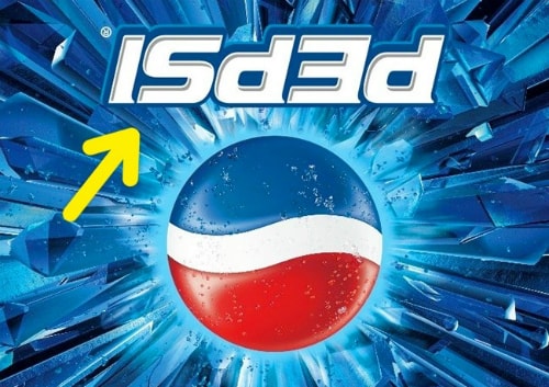
On one occasion during Mexico's All Saints Day (also known as the Day of the Dead), Pepsi produced a series of products with an upside-down logo. This wasn't a mistake, but entirely intentional. The upside-down "Pepsi" sounds similar to "is dead."
Durex
|
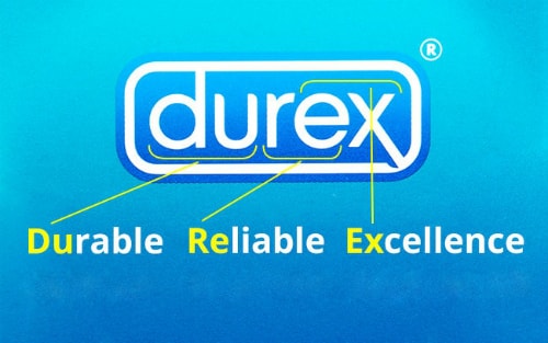
Durex is an acronym for Durable, Reliable, and Excellence. Essentially, these are the qualities users expect from this product.