20 Premier League teams have unveiled their kits for the 2016/17 season. Many of the kits are eye-catching, but there are also a few that have received criticism from fans:
Here are the 9 most criticized shirts of teams in England
 |
| Bournemouth's flashy banana green away kit |
 |
| MU's home kit inspired by the industrial revolution has also been criticized by many fans. |
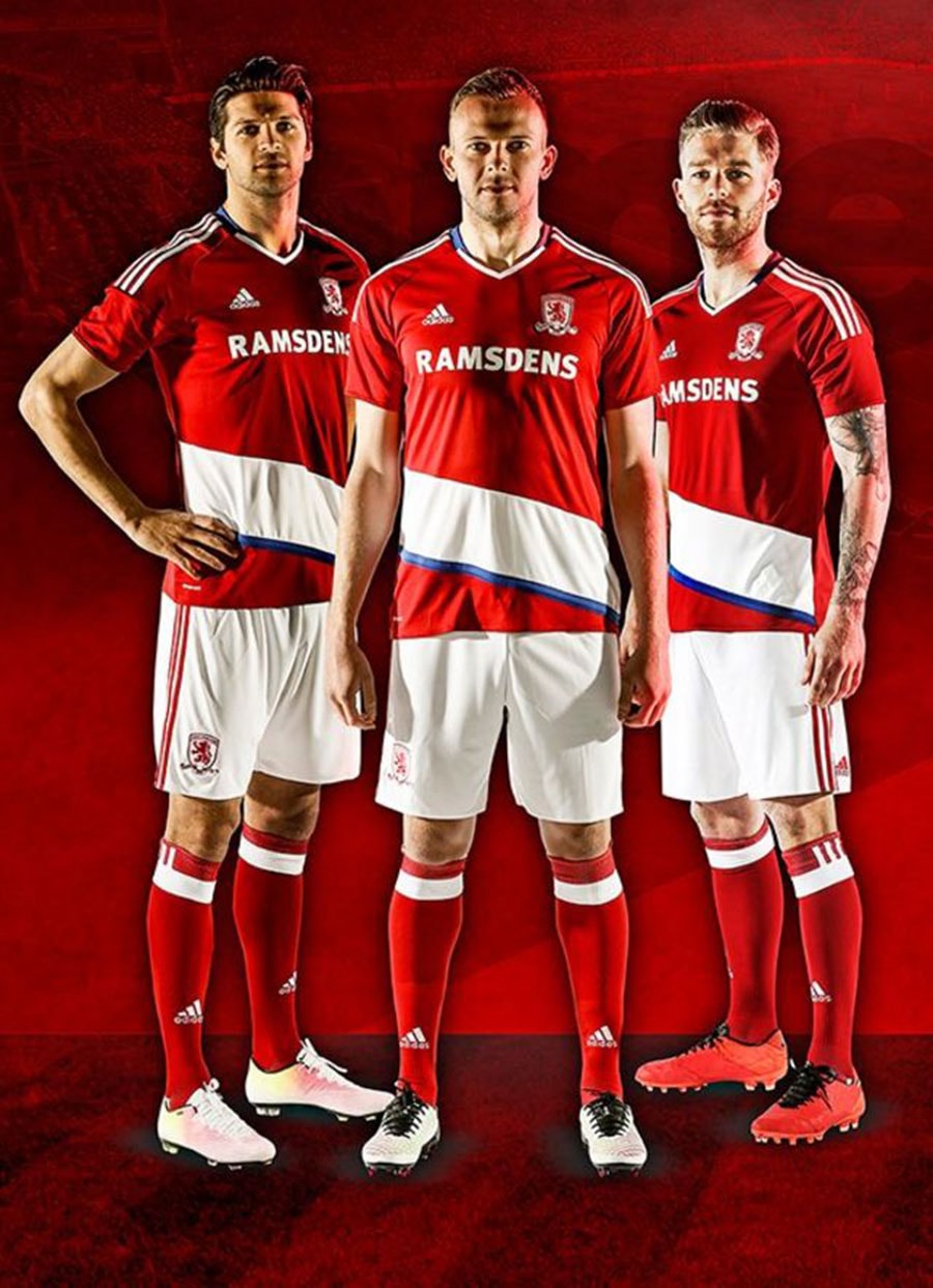 |
| All the details of the Adidas designed Middlesbrough home kit are supported... except for the diagonal white stripe on the shirt |
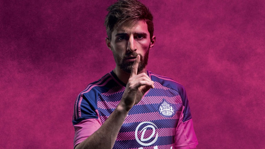 |
| Sunderland's third kit has also been criticised for its messy mix of colours. |
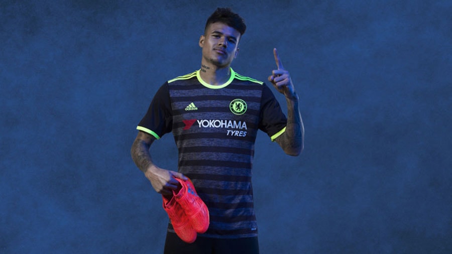 |
| Chelsea's away kit is too dark with a design that is not really popular with fans. |
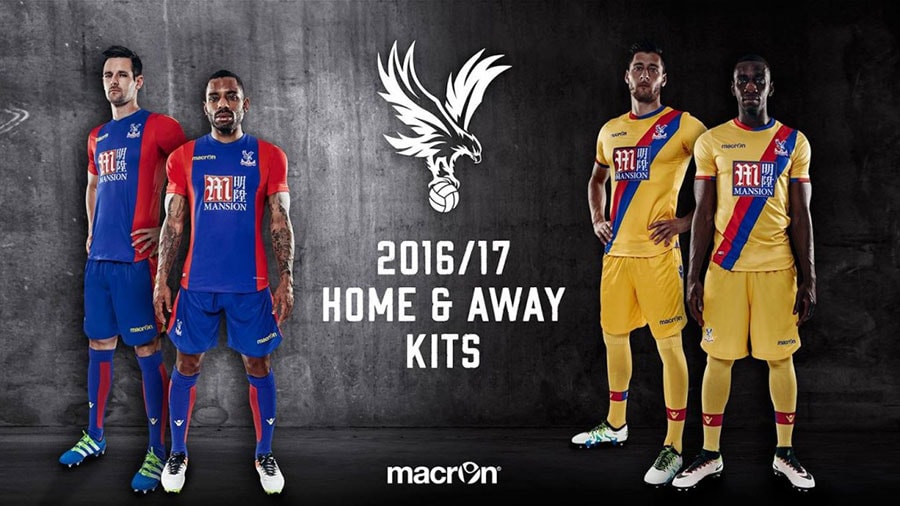 |
| Crystal Palace's away kit has also been criticised for being too bright yellow. |
 |
| Southampton is a team that has been criticized for both its home and away kits. |
 |
| Tottenham's third kit was also criticized. |
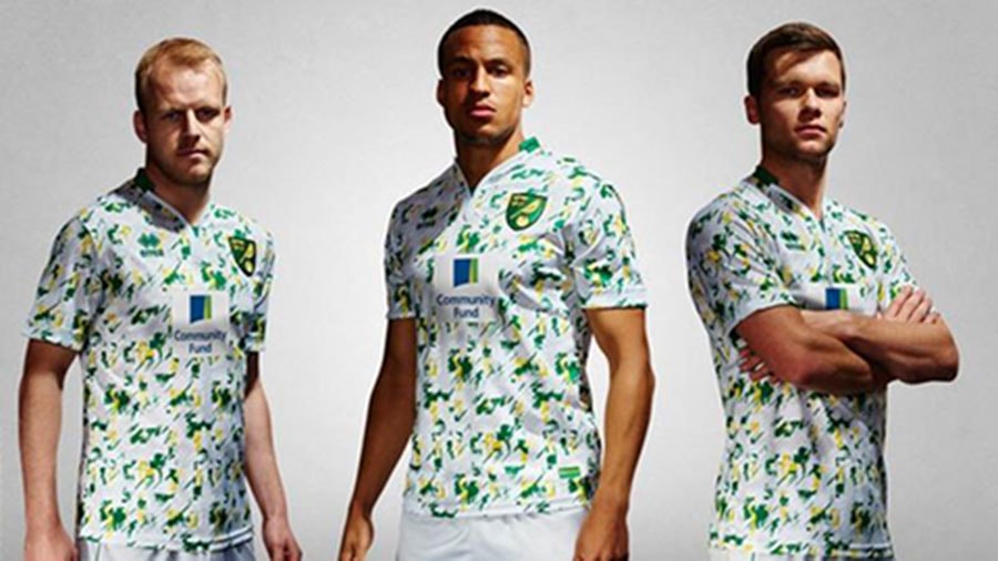 |
| Norwich have been relegated, but their third kit is a disaster for their fans. |
According to Bongdaplus


